Helvetica: can a font be a film?
September 2008
I’ve always been curious about fonts. Well, about typefaces, really. Strictly speaking, a font is an instance of a typeface with a particular size and style. In a programming language, you might say it this way:
helvetica_10pt_bold = Helvetica(10, bold=True)
Helvetica is the typeface. “Helvetica 10pt bold” is the font.
 Yes, I admit to having been an amateur typophile for a while now. It probably started with Donald Knuth, and me poring over his books in the Canterbury University library between lectures, just basking in pure letter shape.
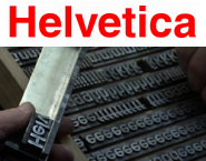
Anyway, Helvetica is no longer just a Swiss typeface. It’s now also a feature-length documentary about the typeface and about graphic design in general.
It runs for 80 minutes, and it interviews a number of top type designers. Still, it’s certainly interesting for a general audience. My wife prepared herself to be bored, but actually found it quite compelling.
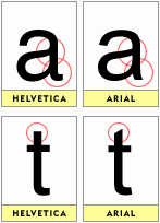
 Another interesting thing is the Helvetica vs Arial debate (if you can call it a debate). Arial is pretty much a cheap clone of Helvetica, designed by Microsoft so they didn’t have to pay Linotype’s licensing fees. I don’t have to try too hard to believe that.
The differences between the two typefaces are very subtle, but interesting. Check out the differences in the ‘a’ and the ‘t’ in the image to the right. Mark Simonson has more on this.
Anti-Microsofting aside, I do prefer the font handling in Windows XP over anything else I’ve seen. It’s just so clear and sharp. Linux still doesn’t have it together. And even Mac OS’s fonts aren’t that great — Apple seems to be pretending we’ve already all got 300dpi displays.
So check out Helvetica, the film. I think you’ll enjoy it, typophile or not. At the least, it’ll make you do a double-take at every other sign and billboard — “Hey, is that Helvetica?”
Comments
Bryan 15 Sep 2008, 21:26
I just feel the need to defend my fav OS, now that I finally can in this respect: with very minor tweaking, Linux’s font handling is now actually very much together.
I’m not quite enough of a connoisseur to know if the hinting algorithms are up to scratch, but I doubt very much if even you’d notice the difference there. At any rate, it shows strokes as exactly one pixel thick, no matter what the curve. Even those S’s are pretty.
The LCD subpixel smoothing on Linux is (finally) actually much better than windows, IMHO. On Windows, vertical strokes will have faint blue/red haze on one side of them. That’s because they’re just thicker than one pixel, so Windows decides it’d better make it look like it. But it actually looks fuzzy. Linux gives you that option, but I don’t like it. You’ve also got the option of telling it to make vertical strokes exactly 1 pixel wide, no fuzziness. Less accurate, but looks beautiful.
Of course, some would say that options are bad.
Admittedly, some apps (fewer & fewer) don’t use the system font renderer. And unfortunately, Inkscape (partly because it needs to do its own rendering, by definition) doesn’t either. That’s my biggest gripe.
Art 16 Sep 2008, 03:50
May I offer a dissenting opinion?
As a font geek, I was excited to see this movie on Netflix. What a disappointment! I had hoped for a visual, animated tour of what makes Helvetica so popular, so perfect. I wanted to see how it grew out of Grotesk and how it differed. Or: if Helvetica is so perfect, why are there more recent sans-serif fonts, such as Tahoma and Verdana? Or: why do type aficionados adore Helvetica but despise Arial?
Instead we were treated to an endless stream of street signs in Helvetica and interviews with 80-year-old type designers (or their 50-year-old sons) about the meaning of Helvetica. Give me a frickin’ break! Don’t tell me that it’s better than the others, show me!
Ben 16 Sep 2008, 06:36
Hi Art — fair point. It was interesting, but it wasn’t nearly as good as it could have been (note that I don’t focus on it’s “greatness” in my review). As is, I think it could have been shorter and tighter, and I think less interview and more interaction with the typeface itself would have been good too.